BREAK THE NOISE
Typography
Book making
Interviews
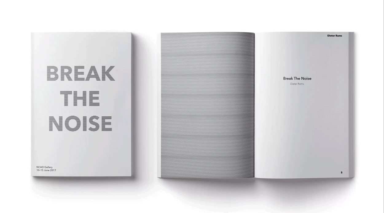
For this project I had to propose a catalogue showcasing the work of Dieter Rams. The catalogue was a form of advertisement for the upcoming exhibition showing Dieter Rams creations over the years. It was important to keep everything paired back in order to reflect Dieter Rams minimalistic style.
I decided to follow Dieter Rams principle rules when designing the catalogue. Colour was used for function rather than decoration, and everything was paired back and minimal. This project taught me the lesson that simple is not easy, but rather difficult.


The catalogue showcased some of Dieter's greatest work. Following the minimal style of the objects, I created illustrations to support imagery throughout the catalogue.


